 Skip to content
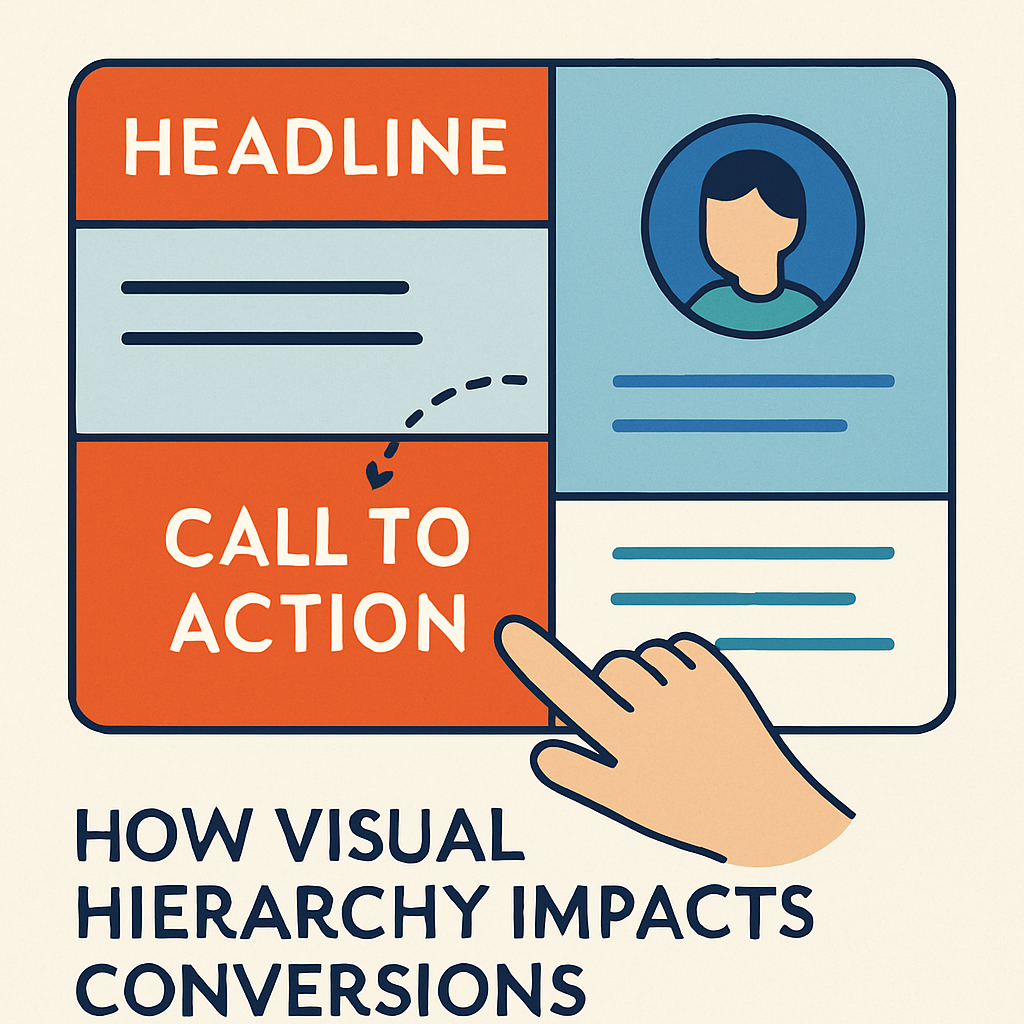
Introduction
Your website has just seconds to capture attention.
What users see first—and how you guide their eyes—directly affects how long they stay, what they read, and most importantly… whether they convert.
That’s the power of visual hierarchy.
In this post, we’ll explore how proper use of visual hierarchy can improve your conversion rates, reduce bounce, and create seamless user journeys.
What Is Visual Hierarchy?
Visual hierarchy is the design principle that arranges elements on a page based on their importance. It helps users intuitively understand:
- Where to look first
- What to do next
- Which content matters most
Think of it as guiding users through a story—your story.
Why Visual Hierarchy Impacts Conversions
1. First Impressions = Instant Decisions
Users form opinions about your site in under 1 second.
If your layout is cluttered, confusing, or lacks focus, users bounce—before they ever see your offer.
A strong visual hierarchy:
- Directs attention to CTAs
- Prioritizes key benefits
- Reduces decision fatigue
2. Helps Users Navigate Without Thinking
When your layout “just makes sense,” users are more likely to:
✔️ Read your content
✔️ Scroll further
✔️ Click your CTA
Poor hierarchy creates confusion → hesitation → abandonment.
3. Focuses Attention on Revenue-Driving Elements
By using visual hierarchy, you can guide users to:
- Join your email list
- Schedule a consultation
- Add to cart or complete checkout
Smart designers use spacing, size, contrast, and color to lead users directly to conversion points.
How to Use Visual Hierarchy for More Conversions
1. Use Size to Show Importance
Larger elements = more important.
Example: Headline > Subheadline > Paragraph
2. Use Color and Contrast to Highlight CTAs
Your main button (e.g., “Get Started”) should stand out from all other elements.
3. Apply the F-Pattern or Z-Pattern
Most users scan in F or Z shapes. Align your headlines, CTAs, and visuals to match this natural flow.
4. Group Related Content with Spacing & Alignment
White space isn’t empty—it adds structure. Clean, spaced layouts improve scannability and focus.
5. Use Typography Strategically
- Headings (H1, H2, H3) guide the reading order
- Font size and weight add emphasis
- Avoid too many fonts—it breaks flow
6. Create Visual Flow with Imagery & Arrows
Images that “point” toward CTAs or move the eye down the page increase engagement.
Real-World Example
Bad Visual Hierarchy:
- Small CTA buttons buried below 5 blocks of text
- No clear headline hierarchy
- Competing colors with no visual focal point
Good Visual Hierarchy:
- Bold, short headline
- Clear CTA button above the fold
- Supporting image pointing toward the button
- Clear spacing and section divisions
Pro Tip: Test Hierarchy with “Blur Tests”
If you blur your site and can’t quickly spot:
- The CTA
- The headline
- The main value prop…
You have a visual hierarchy problem.
Frequently Asked Questions (FAQ’s)
Is visual hierarchy only important for landing pages?
No—every page, from homepage to blog, should have a clear visual structure that guides users.
Can visual hierarchy affect SEO?
Indirectly, yes. Better UX means more time on site and lower bounce, which supports SEO rankings.
How can I improve visual hierarchy without a full redesign?
Start with typography, button contrast, and spacing adjustments—they make a huge difference.
Final Thoughts
Design isn’t just about beauty—it’s about direction.
A strong visual hierarchy leads the user through your content with purpose, builds trust, and boosts conversions.
Whether you’re building a landing page, product page, or blog—structure matters.
📞 Need help improving your site’s layout or flow?
👉 Let MIK Web Solutions audit your design